Featured Work
06 / 20
Fulcrave Supply Co.
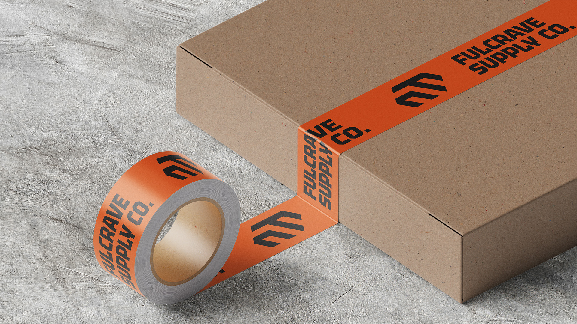
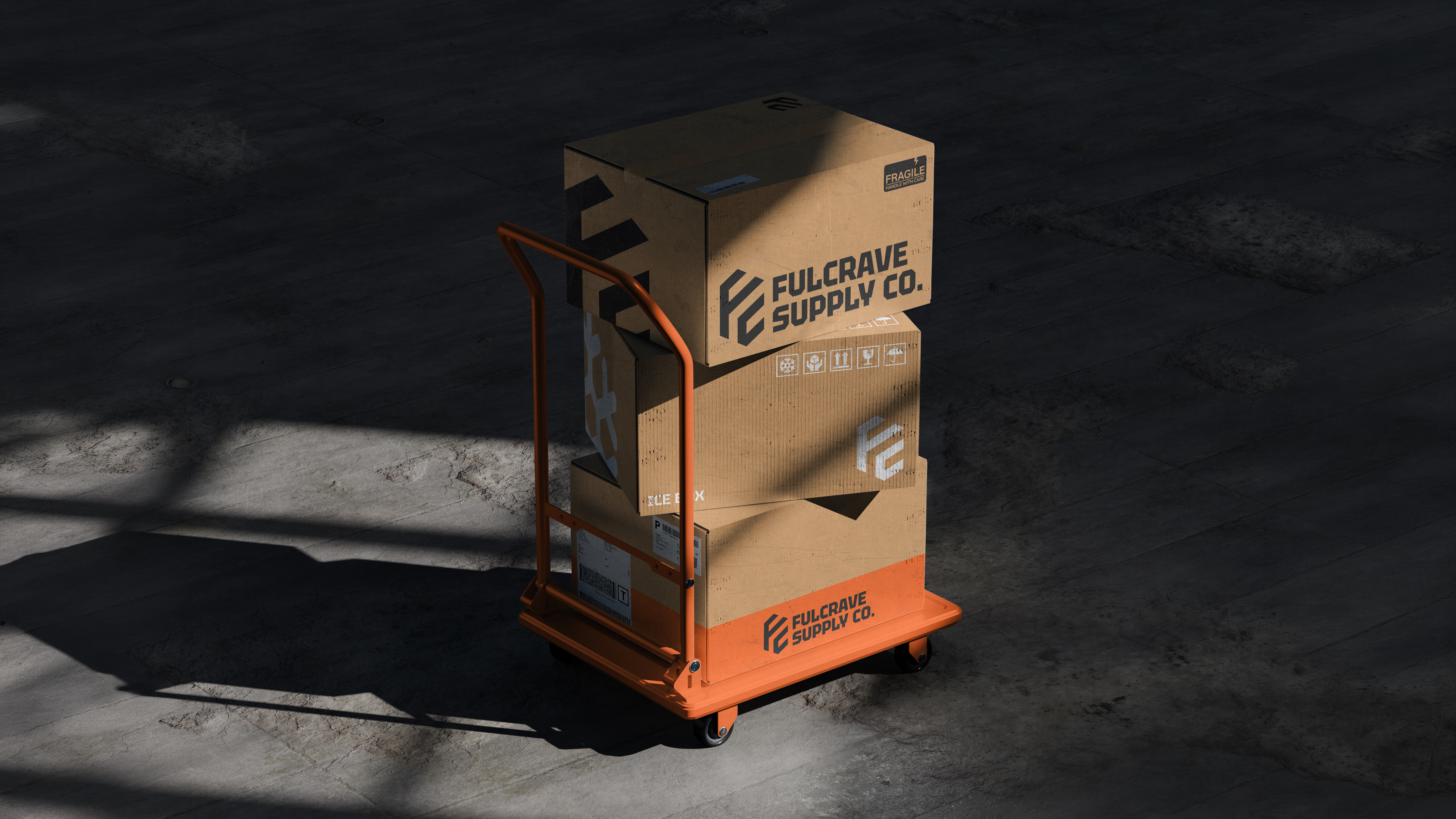
Brand identity and logo concept for a modern food import and distribution company.
Context
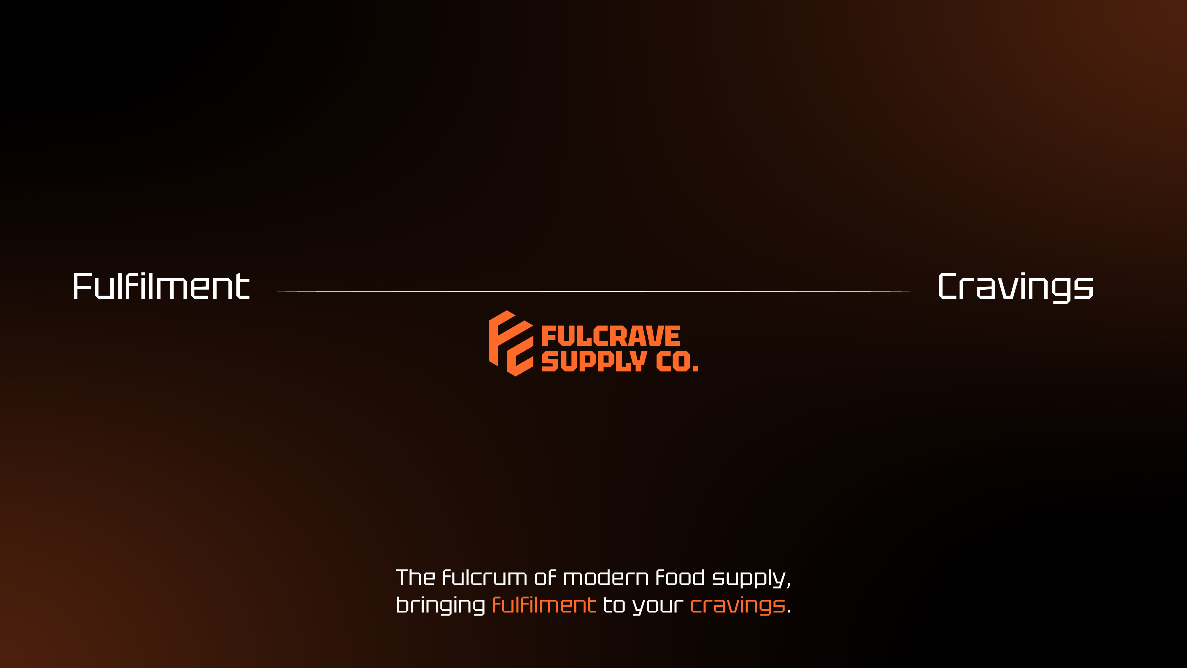
Fulcrave Supply Co. is a conceptual food import and distribution company positioned as the pivot point between supply and appetite.
Its name combines fulfilment and craving, connecting the operational work of moving food from origin to market with the reason those products are worth sourcing in the first place.


Approach
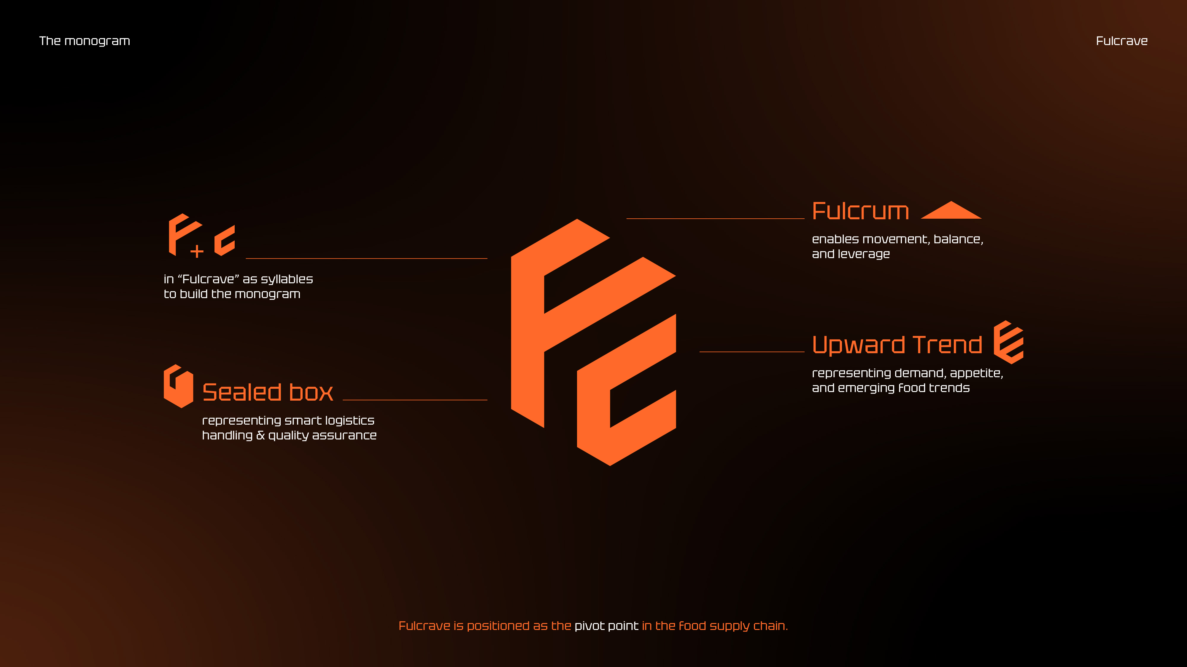
I built Fulcrave around the idea of a fulcrum, the point that holds two sides in balance. For the brand, that point sits between food supply and consumer demand.
The logo brings several parts of that idea into a single mark. Its outer form references a sealed box, representing the operational side of sourcing and distribution. Within it, an upward form suggests growing demand, appetite and emerging food trends. The construction also references a fulcrum while incorporating the letters F and C from Fulcrave.
Together, these ideas position Fulcrave as the pivot point in the food supply chain, handling the operational work of getting food from origin to market without losing sight of what makes those products worth sourcing in the first place.
The wider identity follows the same thinking, balancing the practical side of supply with the changing tastes and demand that drive what comes next.