Featured Work
08 / 20
Enak Enak
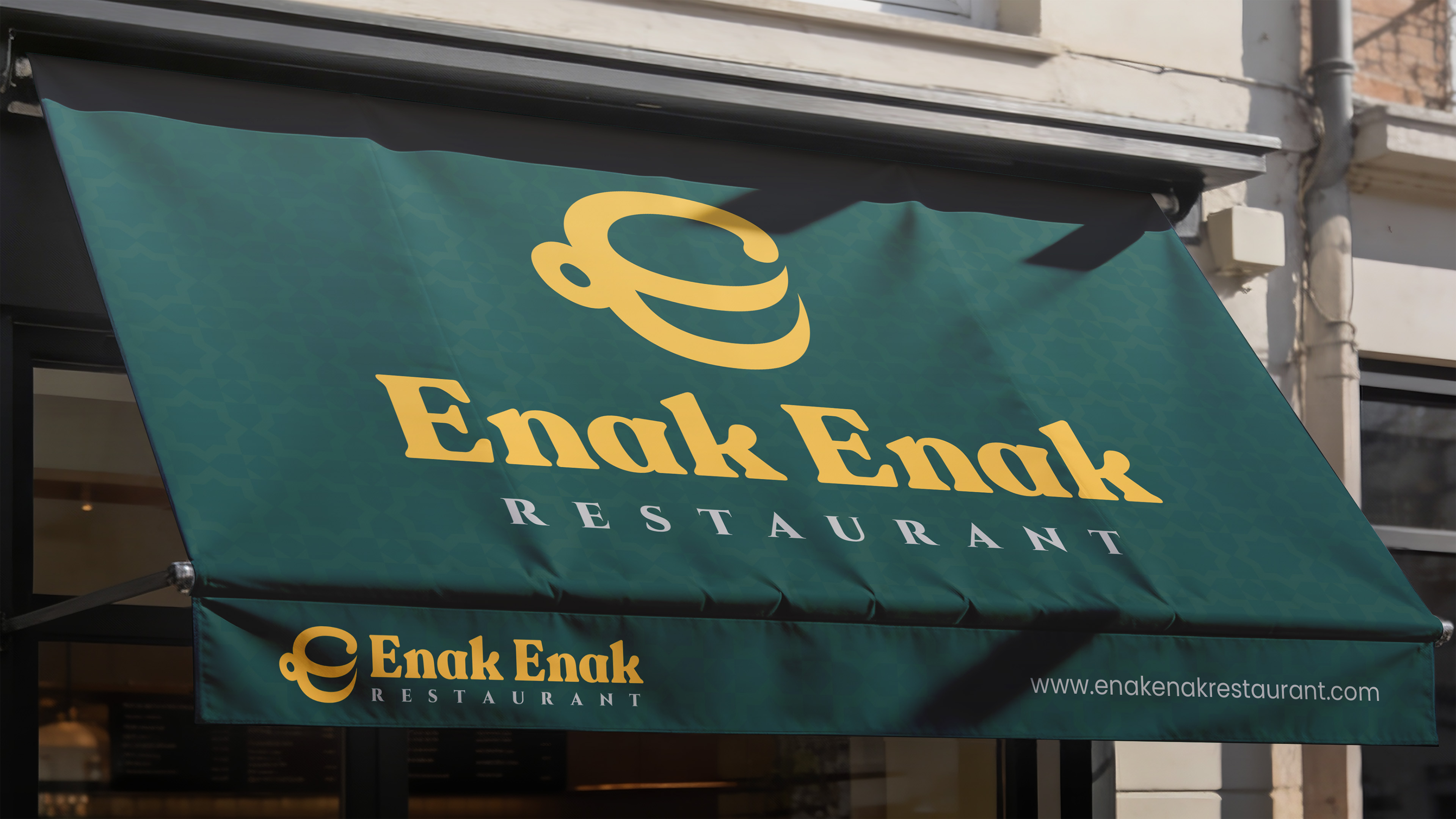
Restaurant rebranding and visual identity across physical applications and conceptual brand touchpoints.
Context
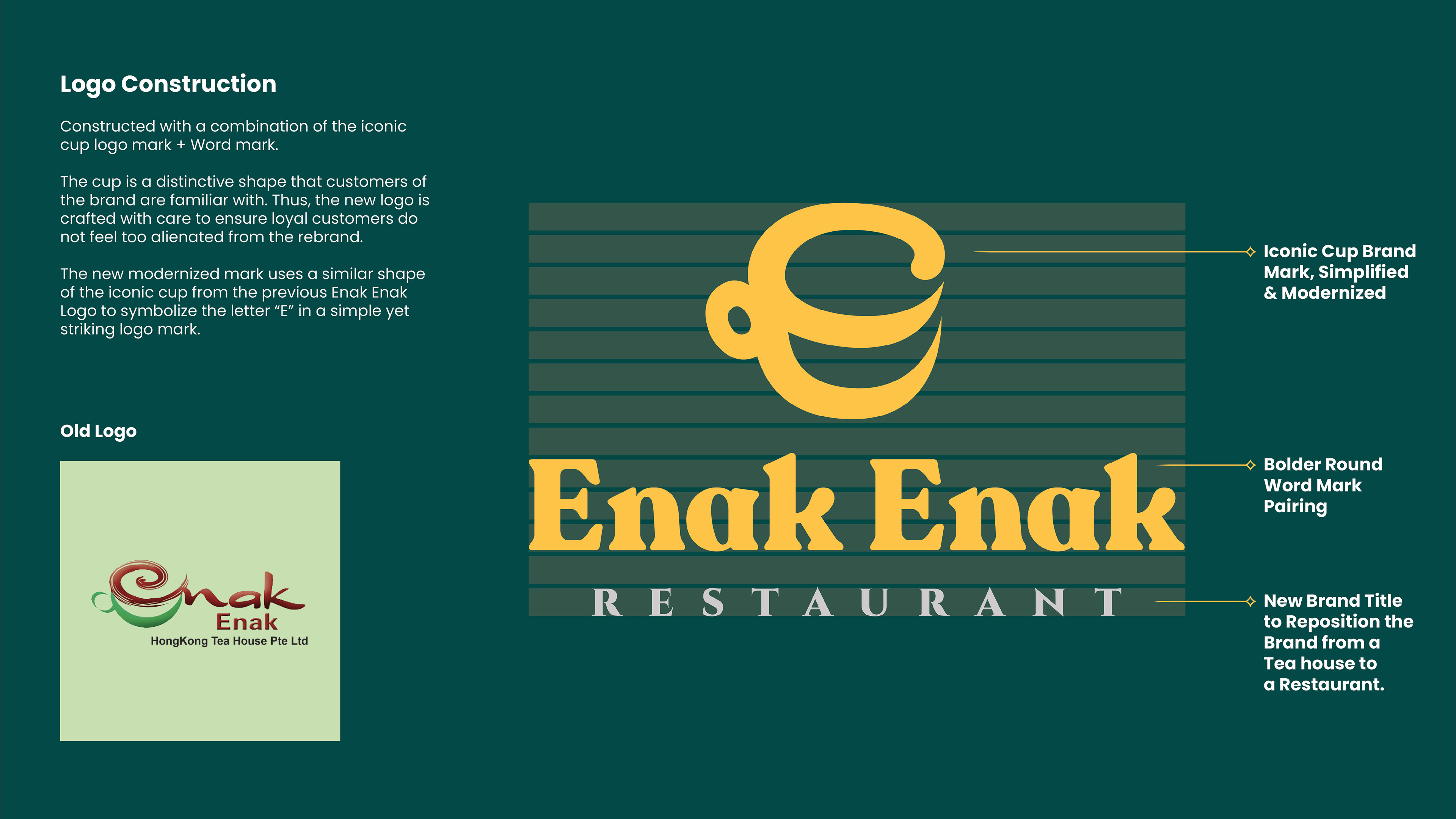
Enak Enak is an established Singapore dining brand serving familiar local flavours in a casual setting. The rebrand needed to give the restaurant a clearer and more consistent visual identity while retaining the familiarity existing customers already associated with it.
Approach
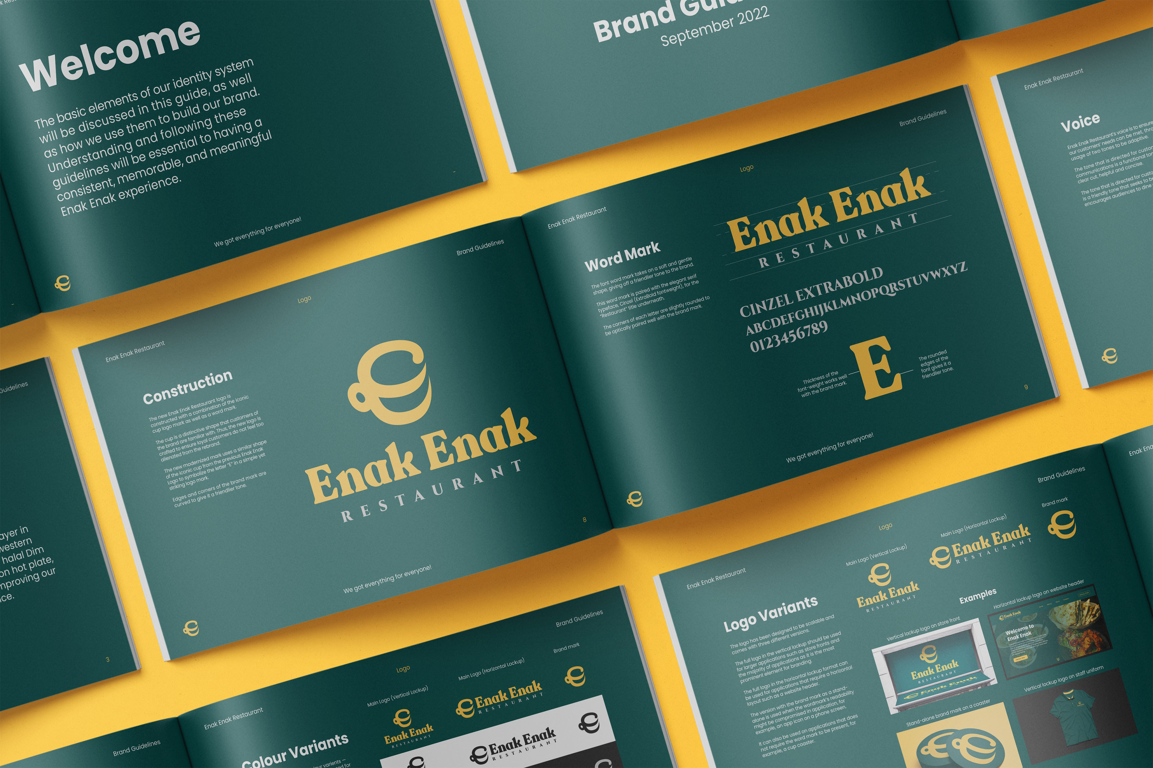
I worked on Enak Enak's rebrand to create a clearer visual hierarchy and a more consistent graphic language across the restaurant's communications.
Because the brand already had recognition, the aim wasn't to replace everything that came before. I focused on building a system that could feel more considered and contemporary while remaining familiar to existing customers.
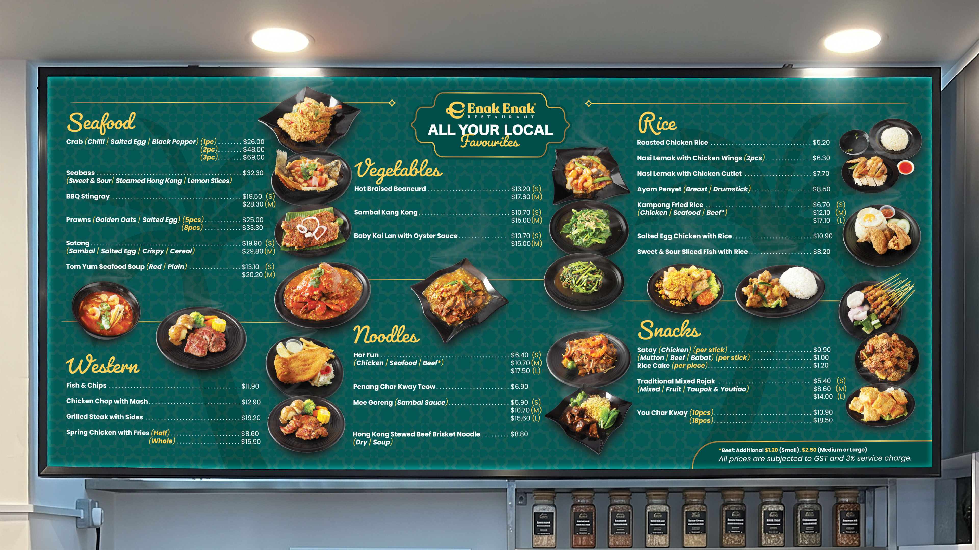
The food menu board was designed as a real customer-facing application of the identity. With a large amount of information to organise, the layout needed to balance brand expression with practical considerations such as hierarchy, readability and viewing distance.
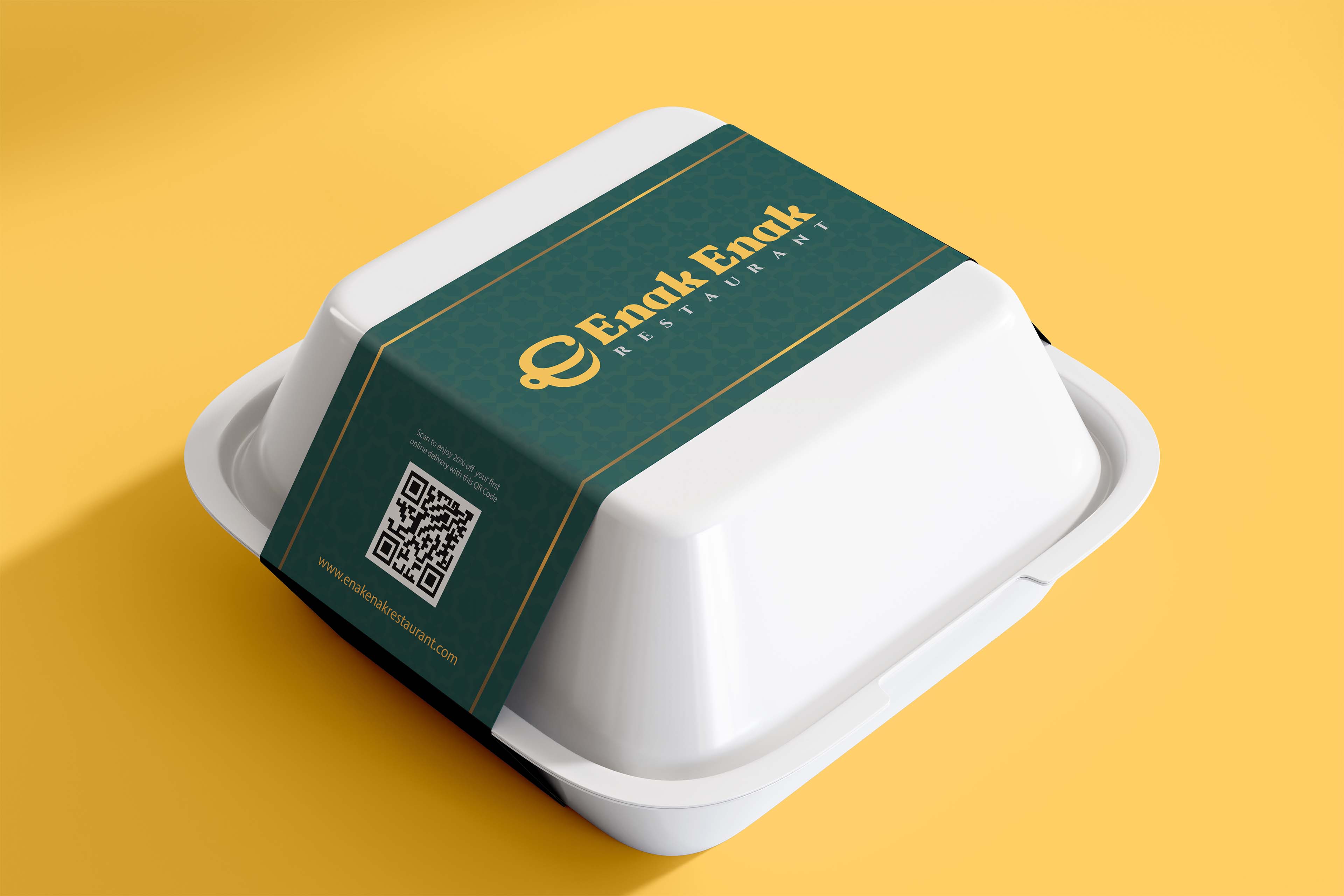
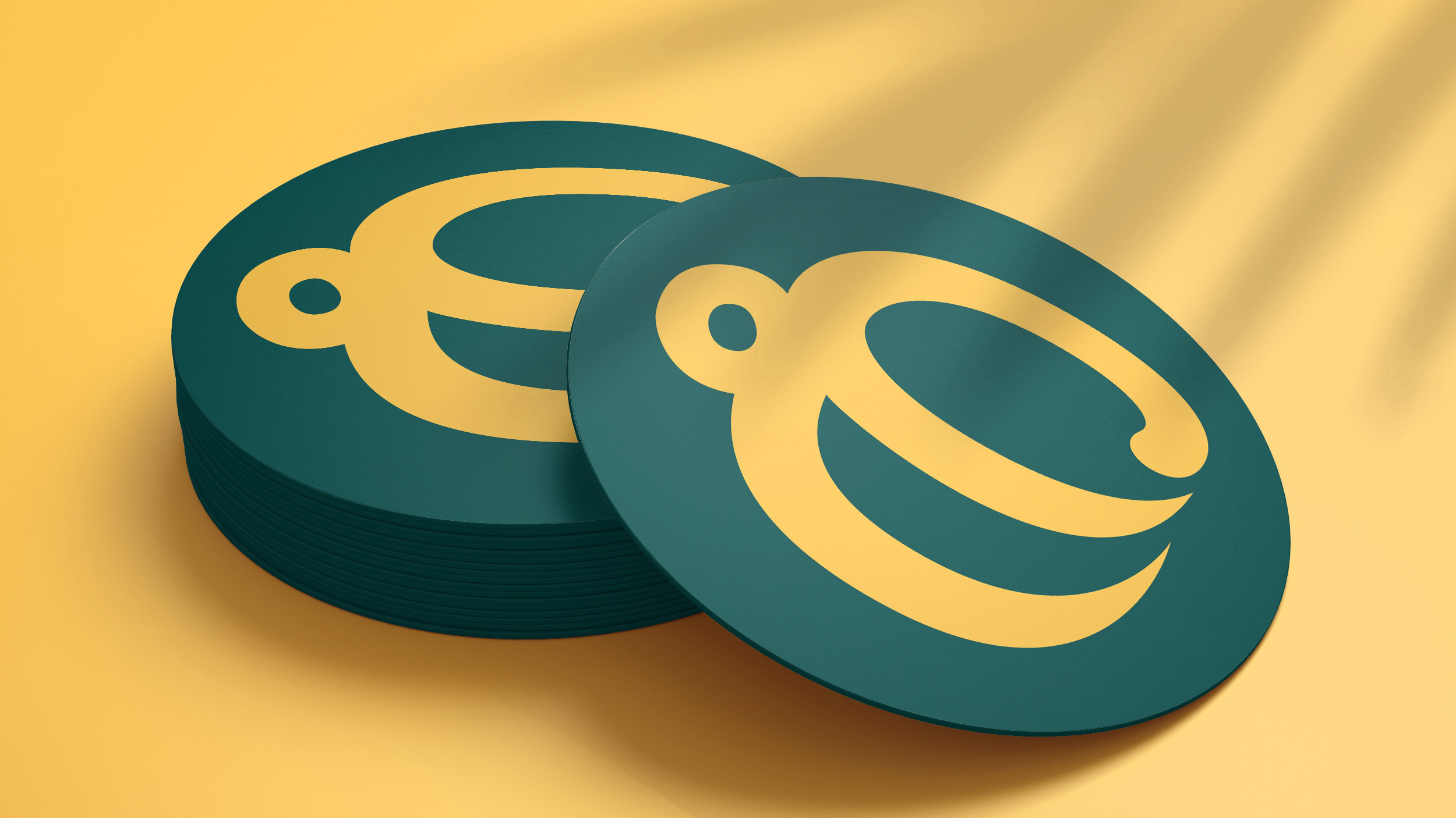
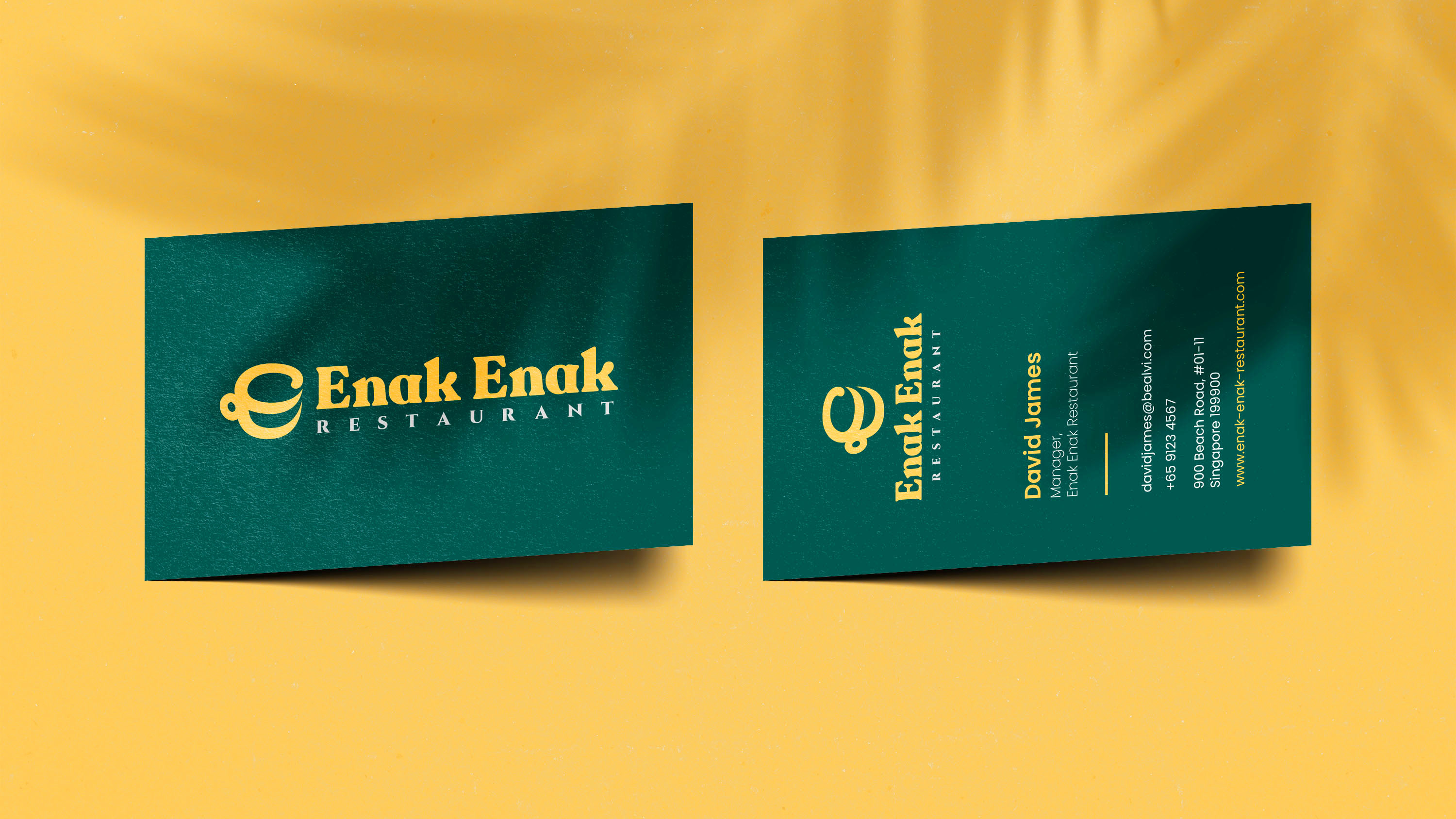
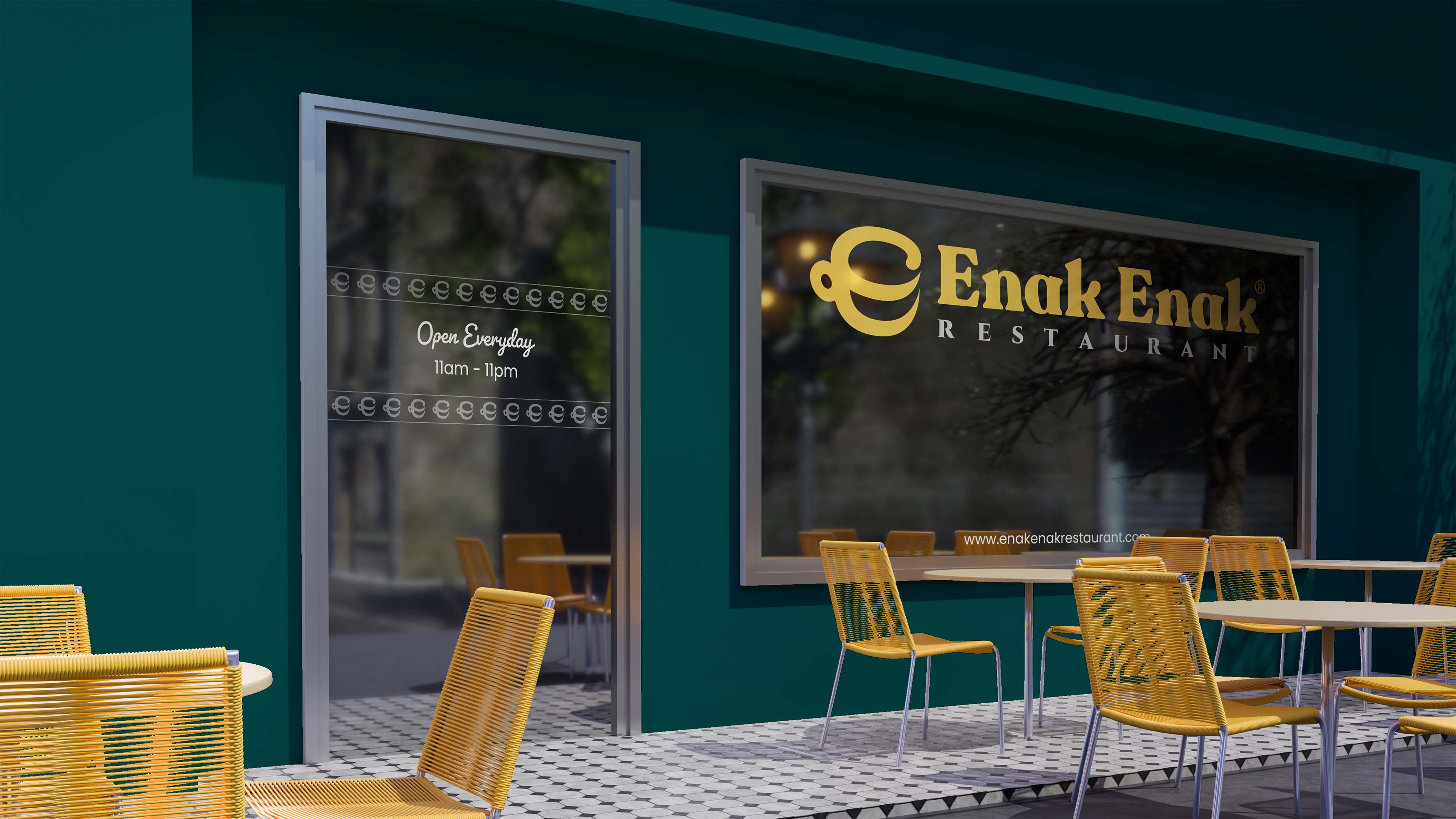
I also extended the identity into food packaging, coasters, uniforms and name cards as brand visualisations. These mockups explored how the system could carry into further touchpoints rather than representing produced applications.
Together, the real and conceptual applications show how the refreshed identity could work as a wider system while staying practical for the restaurant's day-to-day needs.